Client / Agency
Yoga Alliance Dashboard
Location
United States
Role
Prototyping,
UX/UI,
Web Design
Year
2024
URL
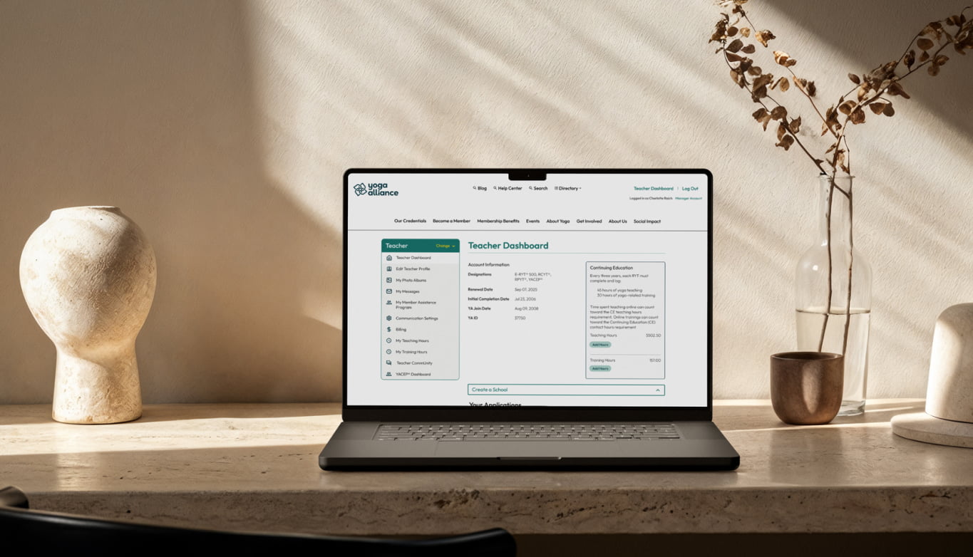
Multi-User Dashboard Redesign for Yoga Alliance
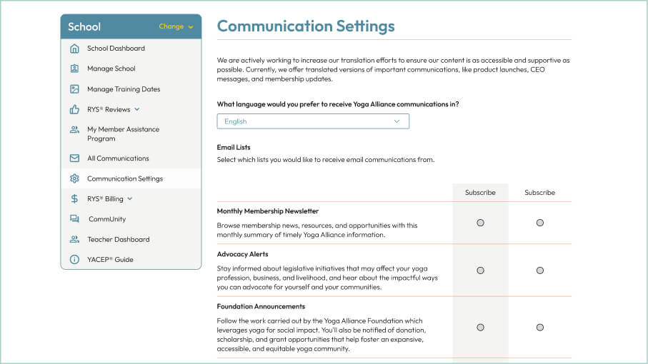
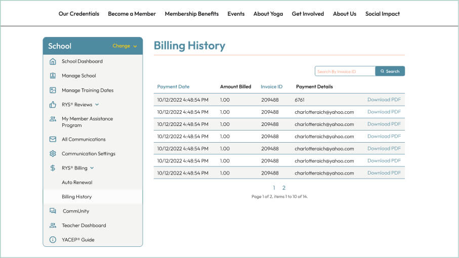
Redesigned the teacher, school, and continuing education provider dashboards for Yoga Alliance. Improved flows and structure while applying the new brand system. Delivered complete Figma wireframes, user flows, and component libraries for registration, billing, messaging, and more.
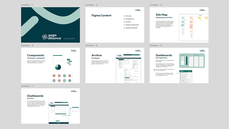
Dashboard File Overview
Organized Figma page showing the full scope of design work — including user flows, component systems, and detailed screens for teachers, schools, and education providers.
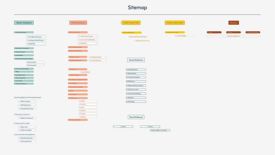
Mapped from Existing Platform
Before diving into UI work, I explored the existing Yoga Alliance dashboard to map every screen and page interaction. This sitemap became the foundation for organizing user flows and ensuring a complete redesign across all dashboard types.
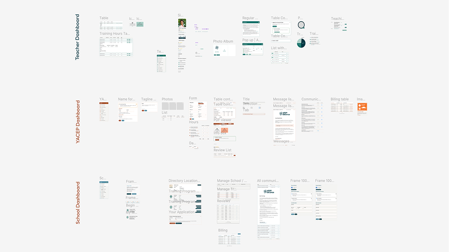
Component Library
Created a full set of reusable UI components to keep the entire dashboard consistent and dev-ready.
User Flow Color Strategy
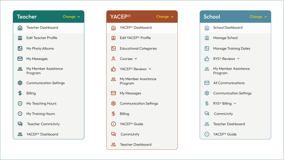
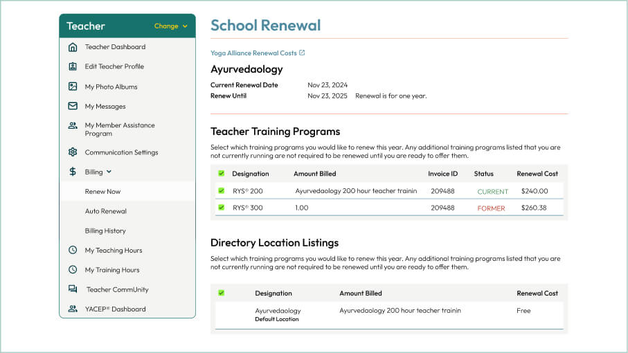
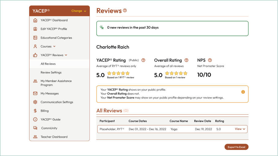
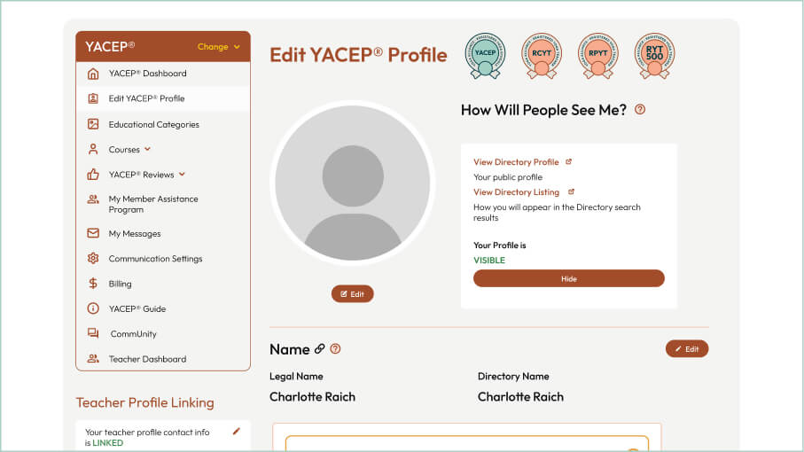
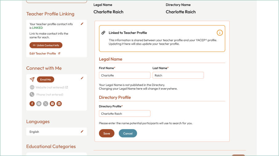
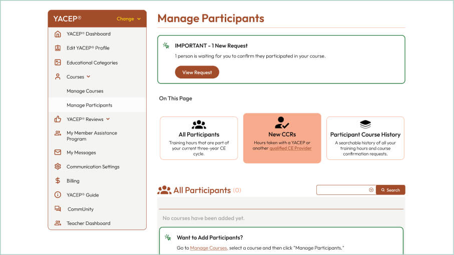
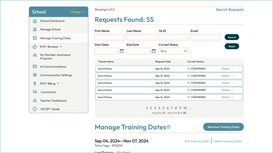
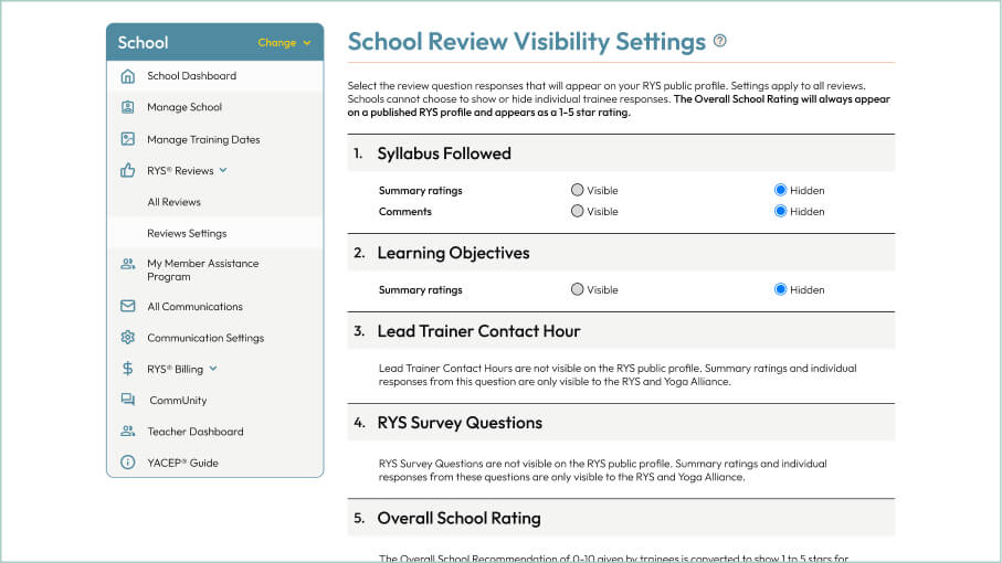
Previously, all user flows shared the same color and only teacher or school profiles used different tones. With the new redesign, each flow received its own dedicated color to make navigation more intuitive. Teachers were assigned Pine Green, YACEP used Tangerine and Rust, Schools used Open Blue, and the remaining flows were designed with Midnight Green, Ash Green and yellow. This way, the entire interface reflects the user’s current flow, improving clarity and orientation across the platform.
User Flow Mapping
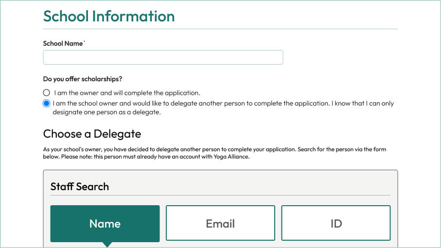
I redesigned the required screens using the custom components I built earlier, following the sitemap to make sure everything was covered — no screens left out, no guesswork.