Client / Agency
Yoga Alliance Website
Location
United States
Role
Prototyping,
UX/UI,
Web Design,
Web Development
Year
2025
URL

Full Website Redesign for Yoga Alliance
Full redesign of YogaAlliance.org using their updated brand and content strategy. Designed scalable, reusable page templates to modernize the site’s visuals, improve navigation, and enhance overall structure. Delivered high-fidelity designs, responsive prototypes, and developer-ready assets.
Timeline
Mid-November to May
Tools
Figma, Wordress, Bricks
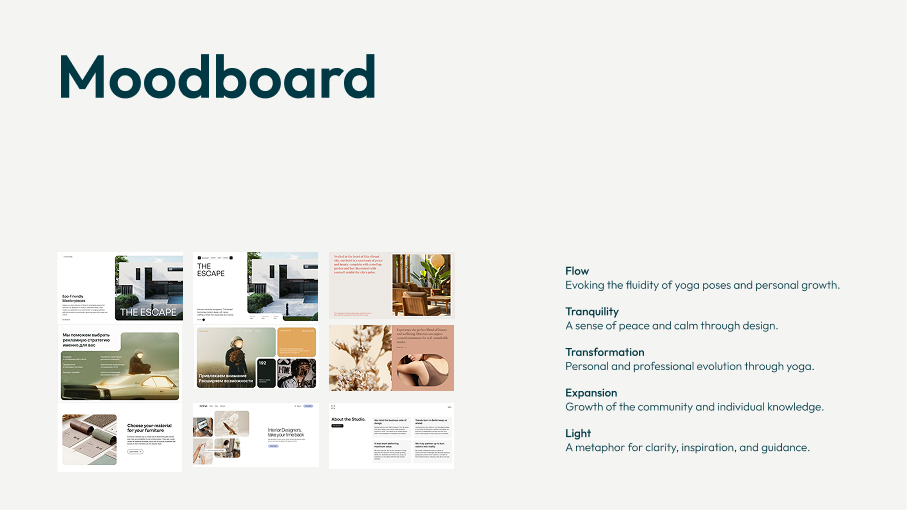
Translating Vision into Visual Direction
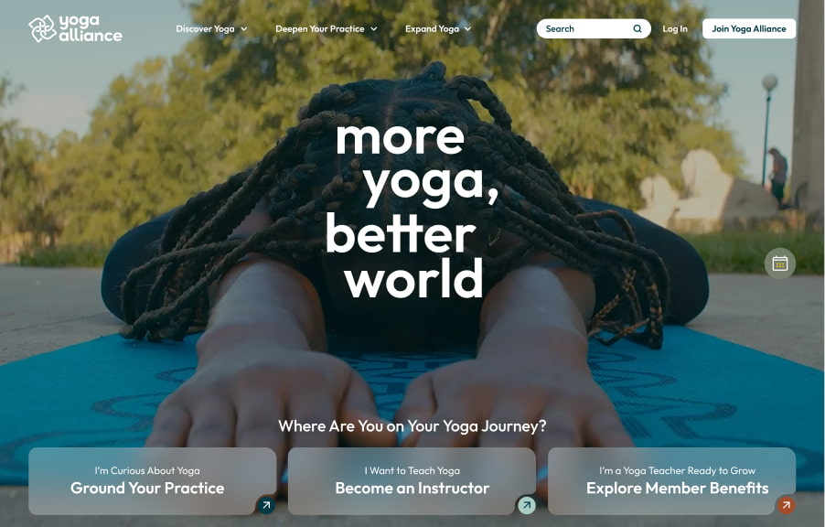
After multiple client sessions, we gathered key emotional concepts they wanted the site to express: flow, tranquility, transformation, expansion, and light. Using these, along with the updated brand guidelines, I created a moodboard that aligned tone, imagery, and color direction to set the creative foundation for the new site.
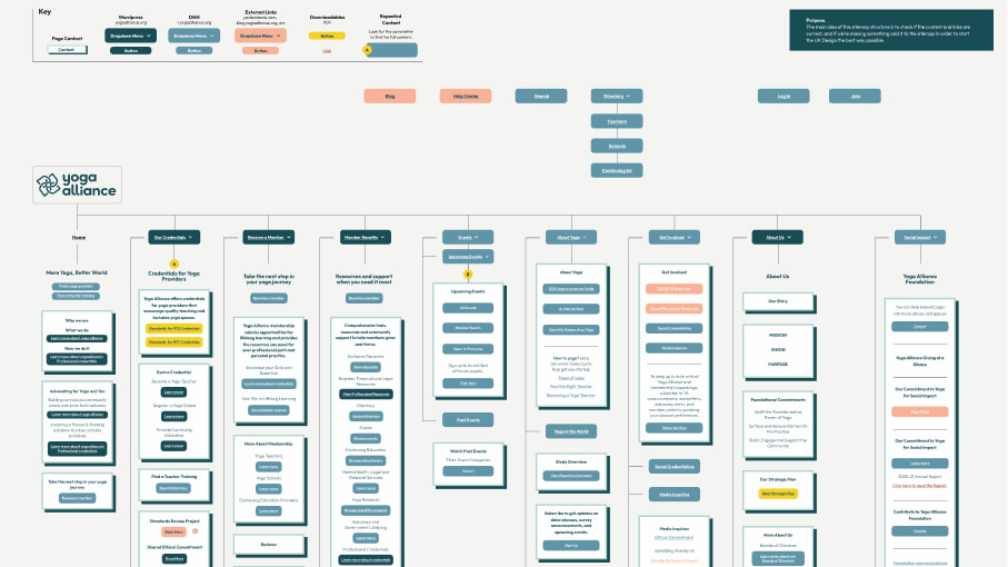
Structuring the Experience Visually
Based on a content doc from the copywriting team, I built a visual sitemap in Figma. This helped validate the new information hierarchy and user flow, and made it easier for the team to suggest improvements early on.
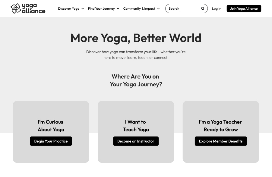
Wireframes to Validate Layout & Flow
Using one page from the content doc as a starting point, I created low-fidelity wireframes to test layout ideas. Once aligned, I was asked to convert 10 of these into high-fidelity mockups using real Yoga imagery and branding elements.
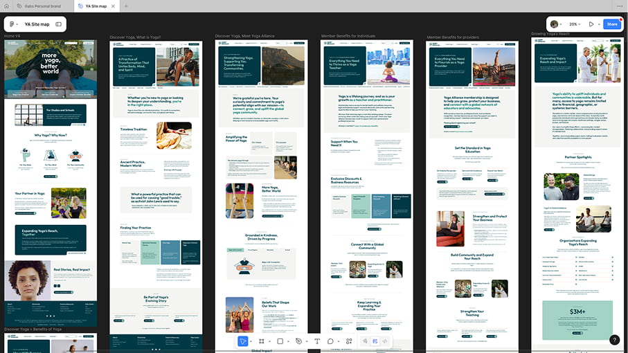
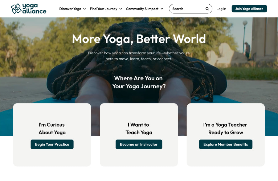
Scaling the Design: 24+ Pages Built
After approval of the initial high-fidelity designs, I created over 24 additional pages based on the new structure and brand system — not including the ones built directly in WordPress during implementation. This allowed for consistent layout, tone, and flow across the site.
Building with Flexibility in Mind
Development was done using WordPress with Bricks Builder, allowing us to create reusable components that simplified both design updates and long-term scalability. These components could easily be applied across pages and edited with new content or imagery.
Consistent Page Architecture Across the Site
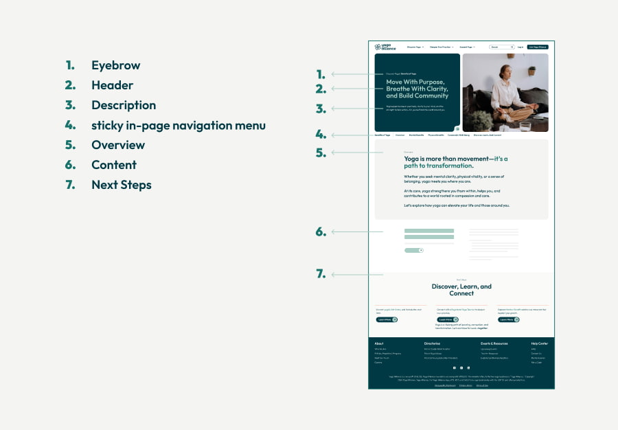
To bring structure and clarity to content-heavy pages, I designed a reusable layout system that was applied across all internal pages. This ensured consistency for users and made the site easier to scale.
Each page included:
A clear hero section with title, intro, and image
A short overview to quickly summarize content
A sticky in-page navigation menu to handle long-form sections
A call-to-action footer prompting users to take the next step
This structure made it easier for users to explore complex content without feeling overwhelmed, and helped maintain a unified experience throughout the site.